* blue
ThemeToggle
| Theme Toggle | |
|---|---|
| Version | 1.3.1 |
| Author(s) | Alex4401 |
| Requirements | |
Default? | |
Theme Toggle is an extension that allows for themes with minimal flash of wrongly styled content. This is achieved by delivering the script responsible for theme loading earlier and separately from other scripts (bypassing the requirement on MediaWiki's ResourceLoader client and having to wait for other modules such as TabberNeue, skin scripts, and so on).
To start using ThemeToggle, follow the setup guide below. Note you almost certainly want the parameter bundled set on at least one theme. See Full documentation for an explanation about available parameters you can set.
Setup guide
If your existing theme is light
1. Visit MediaWiki:Theme-dark.css and paste:
/*** Theme with Dark Background ***/
/* Eventually you will write your entire theme here, and you can delete this example rule and this comment after verifying the config is working. */

/*** Note: Adjusting themes can take up to 15 minutes to 1 hour for cache to refresh.
Make adjustments in large edits/saves instead of single code edits/saves. ***/

.mw-body {
	background: #000;
}
2. Visit MediaWiki:Theme-definitions and paste (THIS IS CASE-SENSITIVE. DO NOT PUT ANY CAPITAL LETTERS.):
* light[bundled]
* dark
3. Done! Enjoy your themes :)
If your existing theme is dark
1. Visit MediaWiki:Theme-light.css and paste:
/*** Theme with Light Background ***/
/* Eventually you will write your entire theme here, and you can delete this example rule and this comment after verifying the config is working. */

/*** Note: Adjusting themes can take up to 15 minutes to 1 hour for cache to refresh.
Make adjustments in large edits/saves instead of single code edits/saves. ***/

.mw-body {
	background: #fff;
}
2. Visit MediaWiki:Theme-definitions and paste:
* light
* dark[bundled]
3. Done! Enjoy your themes :)
Adding more themes (optional)
You can set up as many themes as you'd like, you can see a few examples on ARK and Cookie Clicker Wikis.
- Choose a short name that you'll refer to the theme internally. It will be used for CSS page names and when keeping track of people's theme preferences. As an example,
bluewill be used below. This identifier should not be changed after the theme is created and used by a larger group, or their theme selection will be irrecoverably lost. - Create page
MediaWiki:Theme-bluewith the user-facing theme name you've chosen. For example,Blue, and press 'Save page'. This name should not be too long, since it can be seen on mobile as well. - Decide if you want to include the theme's CSS in your site CSS (Common.css or Vector.css) or only when selected. This is what ThemeToggle calls a 'bundled' theme.
- If in site CSS, the theme's CSS should be added to
MediaWiki:Common.cssorMediaWiki:Vector.css. - If it should be loaded on demand, create page
MediaWiki:Theme-blue.cssand put your theming CSS there. For example:
.mw-body {
  background-color: #11a;
}
- If in site CSS, the theme's CSS should be added to
- Edit
MediaWiki:Theme-definitionsand add a new bullet-point:* blue[bundled]
Due to caching, it may take up to an hour for the theme to become visible.
Full documentation
Defining themes
Themes can be defined at MediaWiki:Theme-definitions, with format resembling the Gadgets extension. Each line is a new theme definition, and must begin with an asterisk (*), followed by an internal theme ID (which are case sensitive and must not contain any other characters than letters, numbers, hyphens or underscores), and optionally options surrounded by square brackets (empty brackets can be omitted).
Because of case sensitivity, the light and dark themes are considered separate from Light or Dark. Only those two lower-case IDs have bundled icons and are eligible for system preference detection (if enabled).
For example:
* light[bundled]
* dark
or
* blue[bundled|default]
* red[bundled]
* purple
Definitions are bundled with the JavaScript sent to the browser. You may need to refresh your browser's cache before changes to the definitions list (or theme CSS) become visible.
Naming
Names to be displayed in the theme switcher, or Special:Preferences, can be set by creating a system message titled MediaWiki:Theme-ID and typing the name as the page's content. See ARK Wiki for an example of this.
Options
| Option | Description |
|---|---|
kind |
Either dark or light, this indicates the general type of a theme's colour palette. A view-dark/view-light CSS class is added next to the usual theme- class to enable CSS rule re-use on wikis with multiple dark themes.In future, this will also segregate themes into "Dark"/"Light" categories in the dropdown menu. |
bundled |
Indicates the theme CSS is already included within MediaWiki:Vector.css (or another skin's) or MediaWiki:Common.css , and no extra needs to be loaded. The default theme of choice should have this option set. |
default |
Indicates this theme should be enabled by default for new users. If multiple themes have this flag set, only the first one matters. If no theme has this flag set, the first defined is assumed. If there is a light and a dark theme defined and there is no theme with this flag set, the script will try to detect the user's preference automatically.
|
user-groups |
Controls which user groups can see the theme in the switcher and user preferences. For example, user-groups=sysop,autopatrol makes the theme visible only to administrators and autopatrolled users.This only hides the theme, and does not actually prevent anyone from using it (via past settings or the JavaScript API). |
Styling (theme CSS)
Themes without the bundled flag have their CSS loaded from a system message titled MediaWiki:Theme-ID.css (for example MediaWiki:Theme-dark.css). This CSS will have precedence in selectors over site CSS (Vector/Common.css).
For bundled themes, TemplateStyles, Widgets, or times when more specificity is needed in the selectors, you can leverage the theme-ID class that is added to the <html> element.
Providing icons for the double-tap switcher
There are two CSS variables that control the simple switcher's icon - --theme-icon (a background-image value) and --theme-icon-size (a background-size value). You can override them depending on the theme class.
dark, light and auto icons are respectively OOUI's moon, sun and halfBright icons.
Monitoring theme usage
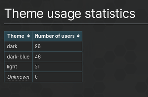
Special:ThemeUsage shows the number of registered users with each theme set as their preferred.
Users with preferences that are no longer valid (because the theme was removed from the definitions list) are shown in a separate row.
TemplateStyles
TemplateStyles permits the selector to be narrowed down by any classes on <body> and <html> elements; therefore to target a specific theme, you have to specify the element (and the theme class) at the beginning of your selector: html.theme-dark.
Implementing a custom switcher
The extension provides a ResourceLoader module named ext.themes.jsapi, which can be used to implement custom switchers over skin or Common.js. You can ensure it is loaded before your code is executed through mw.loader.using (or using a gadget with a dependency), and obtain the interface with mw.loader.require. To turn off the built-in switcher, request $wgThemeToggleSwitcherStyle to be set to 'custom'.
Module exports include:
const CONFIG: SwitcherConfig- Generated configuration object supplied by the server.
- Fields:
themes(string[]),supportsAuto(boolean),preferenceGroup(string?),defaultTheme(string). const LOCAL_PREF_NAME: string- Name of client-side local storage key that stores current theme for anonymous users.
const REMOTE_PREF_NAME: string- Name of the server-side user preference that stores current theme for logged-in users.
runSwitcherInitialiser( fn: () => void ): void- Executes the function (supposed to set the switcher up) when core module loads and there is at least two themes.
whenCoreLoaded( callback: () => void, context?: any ): void- Safe-guard function that executes the callback (bound to the context) once the
MwSkinThemeglobal becomes available. prepare(): void- Call this function when your switcher initialises. It invokes
trySanitisePreferenceandtrySyncNewAccount, and may be expanded in future. trySanitisePreference(): void- For anonymous users only, clears local theme preferences if they point at an undefined theme.
trySyncNewAccount(): void- Synchronises local and remote preferences (local will override remote if different). This is for users who have just logged in after changing their theme when logged out.
setUserPreference( string value ): void- Stores the preference for next visits (local for anons, remote for accounts).
[still WIP; document MwSkinTheme interface] [still WIP; need to set up JSDoc and document features milestone when implemented]
Configuration
- $wgThemeToggleSwitcherStyle
- Controls which theme switcher module is used. If
auto, usessimplewhen there's two or less themes, anddropdownotherwise. - Accepted values:
auto,simple,dropdown,custom. - Default:
auto - $wgThemeToggleEnableForAnonymousUsers
- Controls whether the extension will be enabled for anonymous visitors.
- Changing this requires the HTML cache (Cloudflare level) to be purged for your wiki, as the
- Default:
true - $wgThemeTogglePreferenceGroup
- Overrides the suffix used for server-side user's theme preference ID. The suffix exists because wiki.gg shares user preferences between all the wikis in the whole network, and so it is used to avoid poisoning the preference values for other wikis, and causing issues.
- If
null, the wiki ID is used - on wiki.gg it consists of the wiki and the language, for exampleark_en. - Changing this setting to a single, unique value allows for sharing the preference between your English wiki and its translations. It's recommended that you simply chop off the language code from the wiki ID: for ARK: Survival Evolved Wiki this would be
ark. However, all of those wikis should have their theme definitions and styles kept in sync (while there is currently no definition sharing implemented, the$wgThemeToggleLoadScriptOverridevariable can be used to share the CSS). - Warning: Previous theme preferences are not migrated when the value is changed, and registered users will lose their theme choices. Old entries are also not removed from the database.
- Default:
null - $wgThemeToggleLoadScriptOverride
- Overrides the ResourceLoader endpoint that will be used to load theme styles from. This may be used to share theme styles between multiple wikis by choosing a single one as the "authority" - which will act as the sole style provider.
- If
null, defaults to the wiki's ownload.phppath. - Default:
null - Example: to have the theme CSS loaded from your English wiki, set to
/load.phpon all translations.
Translating
Please submit translations via TranslateWiki.net.
Example wikis
Featuring either:
- Toggle for Light/Dark modes:
- this Support wiki
- UnderMine Wiki
- Dark Deity Wiki
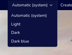
- Many Theme options in a menu:


